*Discovered/Scan:
- FinViz Screen of stocks with Fundamental Value and good recent Quater/Quarter EPS
- ThinkorSwim Spread Hacker of option spreads with high probability of profit
- None recently noted
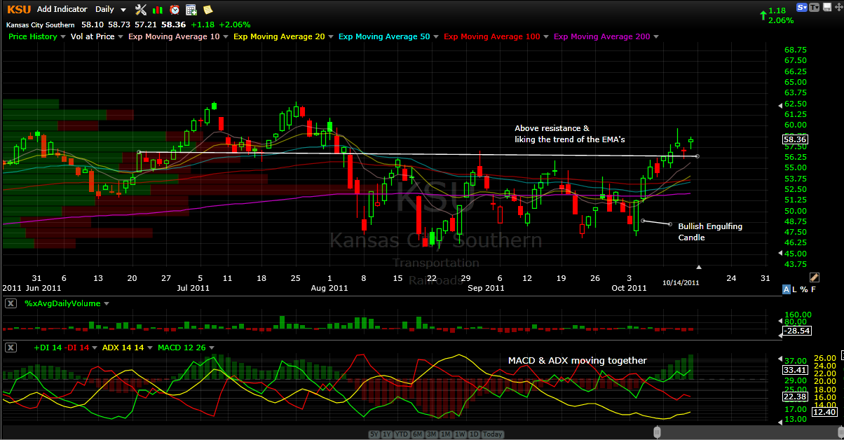
*Chart Analysis
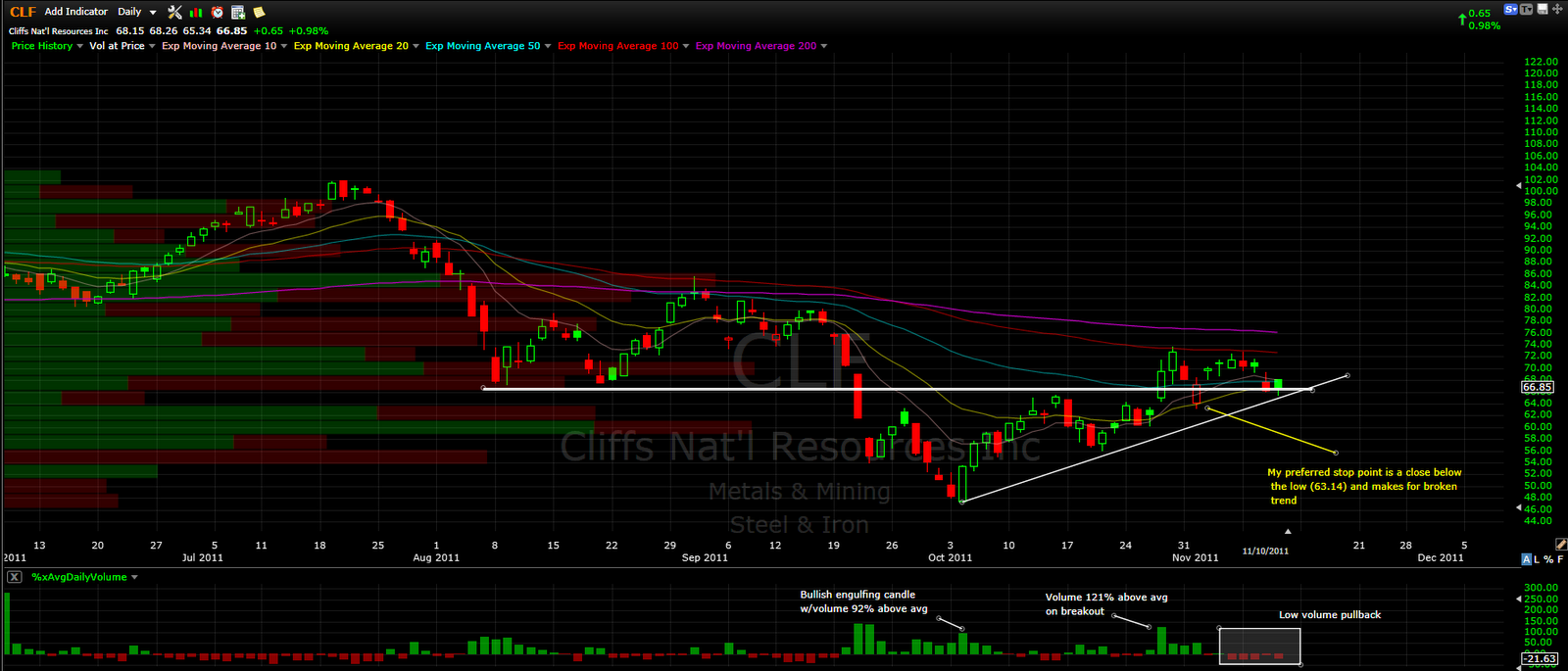
- Possible Inverse Head and Shoulder Pattern
- Other notes on Chart

- Value traders can take note to the following and why this stock is cheap at these prices
- Trailing/Forward P/E
- PEG (Price to Earnings Growth)
- Price to Sales
- Price to Book
- Also traders that emphasize on fundamentals take note to:
- Qtr/Qtr Sales
- Qtr/Qtr Earnings
- Return on Equity
- Profit Margin
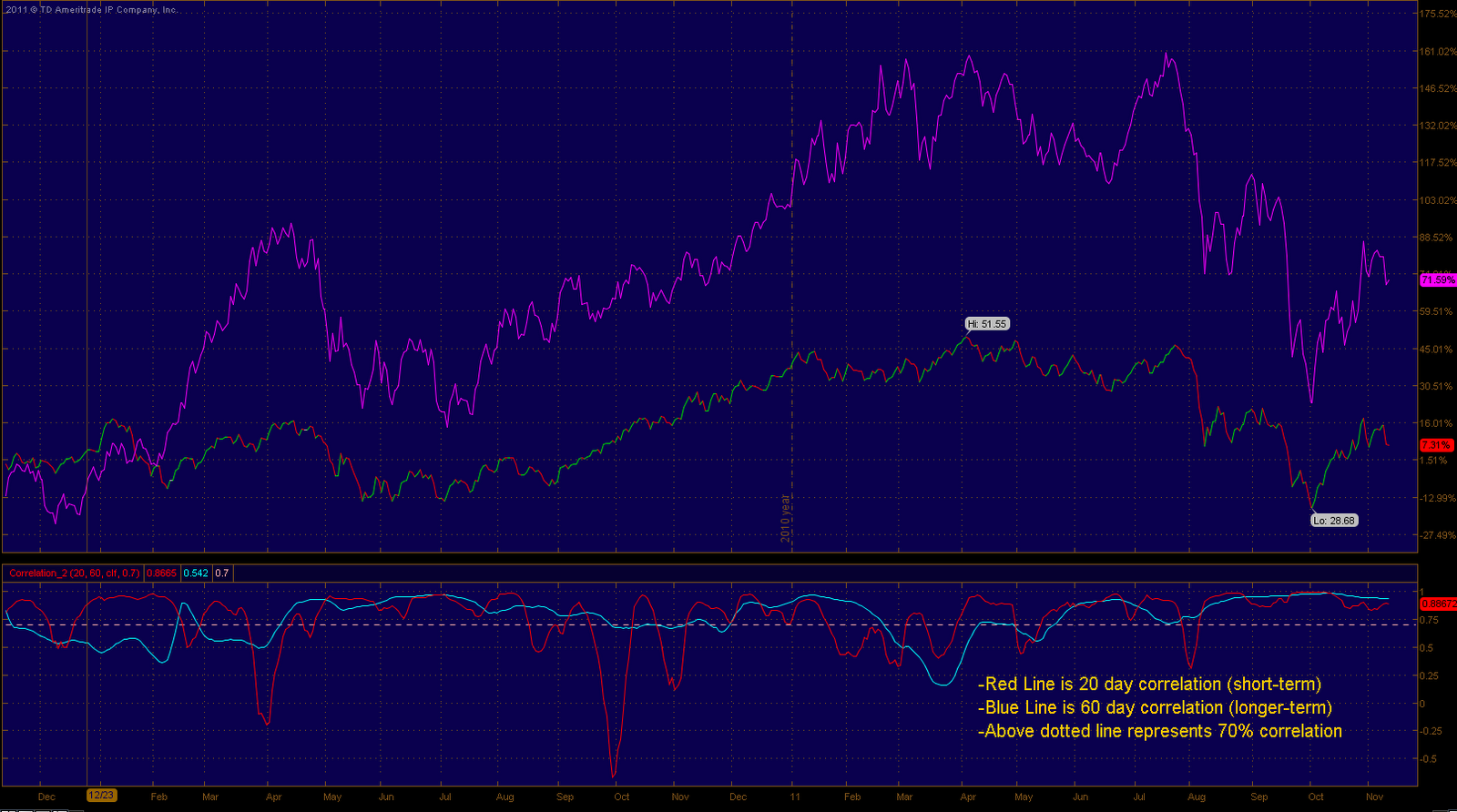
- Correlation study in relation to Coal shown with the respective KOL etf, notes on chart
- Good correlation so if the trader believes KOL can rally, good chances CLF will as well

- KOL is representing a possible Inverse Head and Shoulders much like CLF
* Summary
*Option Strategies:
- Although not much options analysis is provided or did I see any, the technicals and fundamentals line up with this stock for a bullish trade
*Option Strategies:
- Sell the Dec 55-50 Put Spread for credit of 0.72, with buying power reduction of $430.00
- trade has a 82.60% probability of profit
- More aggressive trade would be to go one strike higher
- Sell the Dec 60-55 Put Spread for credit of 1.14, with buying power reduction of $386.00
- A trader could also do the inverse of buying debit spreads with my preference of selling the 75 call or just buy outright calls because the volatility is respectively in the low range but for me right now I prefer credit spreads as I am not able to watch the market on a continuous basis and with the current pace, a trader definitely needs to be attentive